A hardboiled egg. A dish of fresh green herbs. A piece of dry cracker.
To an outside eye, the seder plate may look like a hodge-podge of random foods, hardly enough to make a meal of. But to those of us who sit down to Seder each year, we need only glance at the items on the plate to release their potent symbolism and capacity for story-telling. Suffering and redemption. Oppression and liberation. Death and renewal. Each object becomes the proverbial picture that tells a thousand words.
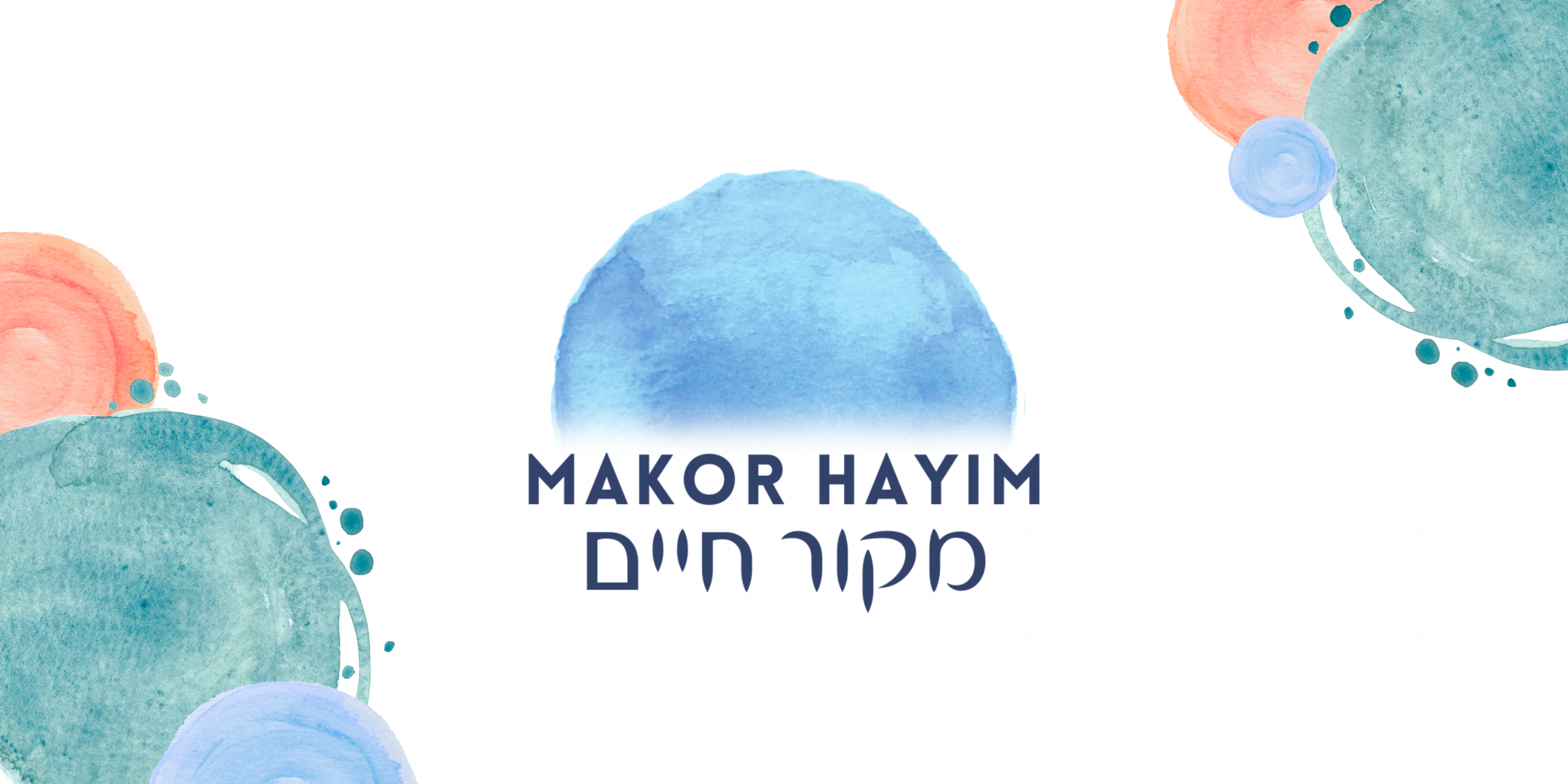
So perhaps it’s fitting that this Pesach sees the soft launch of Makor Hayim’s new logo and visual identity. Makor Hayim has always prided itself on being a community of values, with a clear Vision and Mission. But it must be said, when it came to our visual identity – or lack thereof – we were somewhat in the wilderness. We didn’t make decisions about how we wanted to be seen by the outside world, trusting that folks who were seeking intentional, inclusive Jewish community would make their way to us by word-of-mouth. In some ways, a very Jewish response. It’s what’s on the inside that counts, right?
Now, it’s time that we find new ways to represent ourselves to the wider world. As we embark on a year-long Growth mission to welcome more Jews and Allies craving meaningful, intergenerational Jewish life, it’s time that our inside is better reflected on the outside.
As a group of volunteers, (full disclosure: none of us graphic designers!) it’s been an exciting, daunting, journey coming up with a new visual identity that can do justice to Makor Hayim’s Jewishness, vibrancy and inclusivity. We arrived at the logo design via a thorough and consultative process. We were clear that the goal was not to design the thing by committee, and we knew there will be people who are unhappy with the final result (would we be a Jewish community otherwise?!) But we stand by our process and rationale for what we’ve designed.
The Comms team came up with some initial references and key words, which I worked up into drafts. A shortlist of drafts was shared with the community who were invited to input, to ensure we were taking into account community wishes and observations, which were super informative
Some 20 Builders shared their reflections and preferences, and these were some of our key takeaways that fed into the final design:
- Folks generally concurred with our key words, adding a few of their own. Recurring themes included being welcomed, included, seen, inspired, at home, modern, confident, exciting.
- The vast majority felt strongly about including Hebrew in the logo – so include it we did.
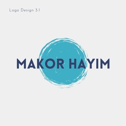
- Designs 1 and 3 were the favourites, and we ended up developing 3 because several Builders expressed a desire to see the meaning of Makor Hayim, a water source of life, to be reflected in our brand.
- We were warned against using a brand enclosed in a circle, which doesn’t scale well for different design purposes. Hence we reworked 3 to include a semi-circle.
- Some wanted to see earthy tones like blue and green, while others stressed that we should have a vibrant, fresh palette that wasn’t ‘boring standard blue and white’ of traditional Jewish branding.
- Feedback on (in)accessibility of the different designs helped us choose more accessible fonts and layouts.
- We heard loud and clear that something simple and confident rather than too detailed/fussy will be easier to use in a variety of contexts and scales.
We then developed Design 3 using a watercolour semi-circle rather than the original flat blue, and a semi-circle instead of the circle, representing the Makor Hayim, the wellspring or Source of Life. We all felt the depth, inclusive arch and watery tones really lent themselves to who we are.
From there, we developed a look and feel based on a painterly, modern watercolour style that is unlike any other Jewish brand out there. The Trustees approved our work this week, and we couldn’t wait to share it with you.
As with all brand identities, there may be more wandering to do. It will no doubt evolve and become even better at representing who we are over the coming months through our newsletter, website, Eventbrite, Facebook and Instagram pages. We look forward to hearing your reflections, and as our Growth project continues, we hope you’ll share invitations with your friends, family and neighbours to experience (and maybe even join) Makor Hayim soon.
So here’s to being seen for the community we are, even at a cursory glance. Fiercely proud Jews, connected to each other, our traditions and the wider community, aspiring to be a Source of Life for all.
Chag Pesach Sameach, and Shechechiyanu!
Leave a Reply